From october 15th to october 24th 2012, remix museum websites. Making them modern, responsive, mobile!
Responsive Museum Week is about rethinking museum experience, starting from their websites. With a simple idea: just modify the css stylesheet from a museum website to make it usable on mobile, tablet, etc.

Pick a museum!
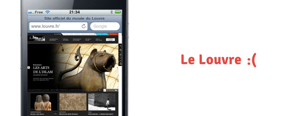
Mobile web access is quickly becoming dominant. Yet, many museums websites are not at all adapted to mobile browsers.
In the museum, it makes a lot of sense to visit smartphone in hand: it's useful to check an historical fact on Wikipedia, find similar artworks in other museums, share our discoveries, etc.
Proprietary smartphone apps? We just want the web, for everybody.
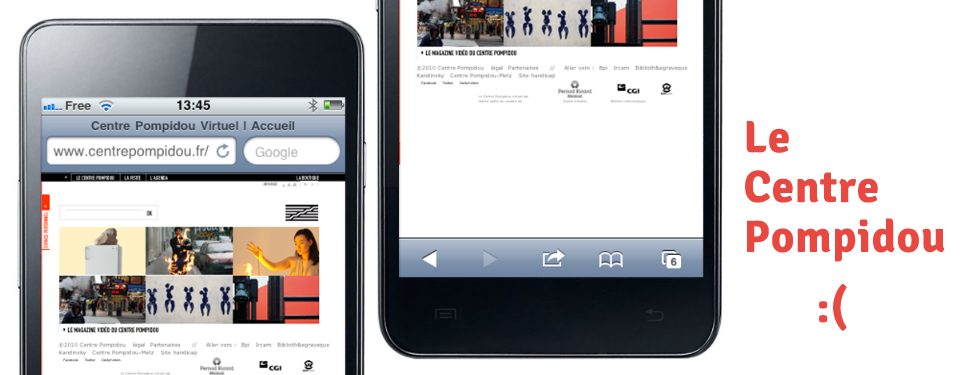
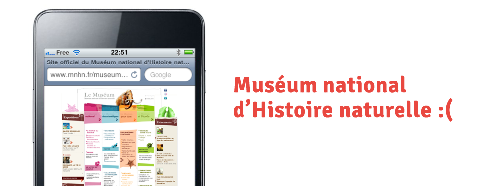
Le Centre Pompidou, le Louvre, Le Palais de Tokyo, le Musée du Quai Branly, le Musée d'Orsay, le Muséum d'Histoire Naturelle...
none of these site is really accessible and readable on mobile, none is built with with responsive web design or mobile first in mind!
"Hack" the museum!

Hack its stylesheet!
Remix CSS styles from the museum of you choice. Make its website modern, responsive, mobile and use all the latest CSS3 possibilities!
Same old markup. But CSS remixing, oh, yes!
Your goal:
Modify (or replace) stylesheets directly (use Firebug, Stylish, etc.) creating a responsive, mobile, and CSS3 version of the site.
Utilisez Stylish !
-

on Firefox et Firefox Mobile -

on Chrome -

on Safari -
sur iOS et tout autre navigateur
Questions?
But why, oh why, all that?Come and chat on the Facebook group!
You'll also find help onUserstyles.org and for an example, take a look at this cool CSS user style based on Wikipedia.

Articles
- готовая еда с доставкой
- Мягкие двуспальные кровати
- shooting star forex
- margin trading
- petikan motivasi
- https://en.octatrading.net/education/article/how-to-buy-shares-in-malaysia/
Share the result!
First fo all, publish your new CSS so that everybody can enjoy it!
On Userstyles.org the biggest repository of user CSS.
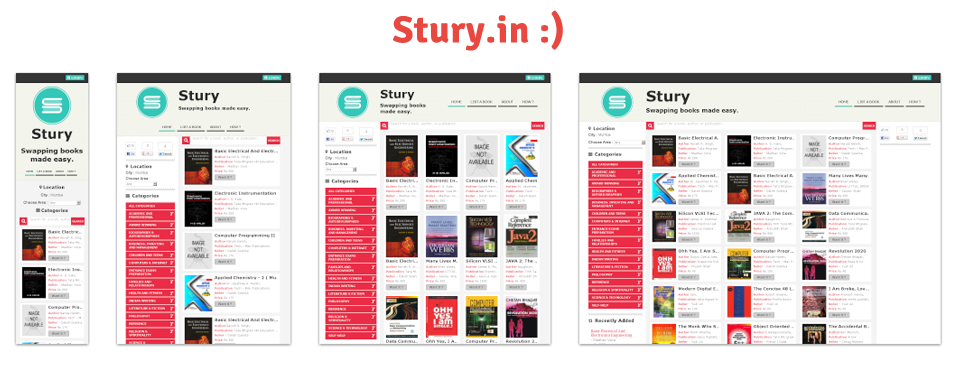
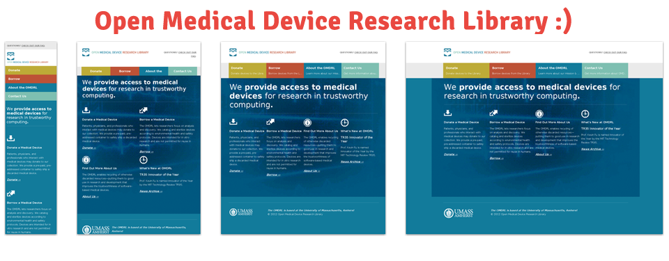
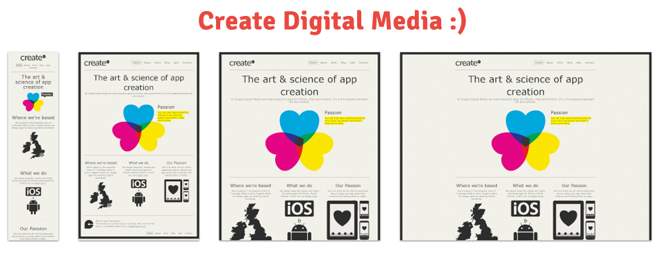
Then, on the tumblr ResponsiveMuseum, share your hack with before / after screen captures :-) Here are the usual screen sizes:
- Smartphone 320px
- Tablette 768px
- Netbook 1024px
- Desktop 1600px
Post the before / after screenshots and link on the tumblr wall:
Publish your CSS hack!

About
Geoffrey and Julien are very sad to see brand new museum websites totally unusable on mobile devices. Mobile web access is quickly becoming dominant. And in museum, there are thousands of possible uses, like get to know more about an artwork or an artist, find a specific object. So they thought they would like to set up a special week, a week for museum users to remake museum websites webdesign, truning them into more responsive, more mobile, more CSS3 websites! Rethinking museums, it's *also* remixing their websites. This idea is a just a week old and… let's go!